
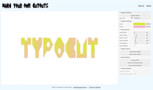
Typocut


Typocut is an interactive tool that mixes collages, typography and randomness. Each letter is a canvas, randomly cropped from configurable gradients or uploaded images, with adjustable size & noise and style parameters. There are three choices for letters:
“Typocut Default“ is when letters are built using strict 3x3 grid with primitives (rectange, triangle, cut-out rectangles, half-circles) that are flipped & rotated and distorted with noise, combining pixel and parametric fonts feel.
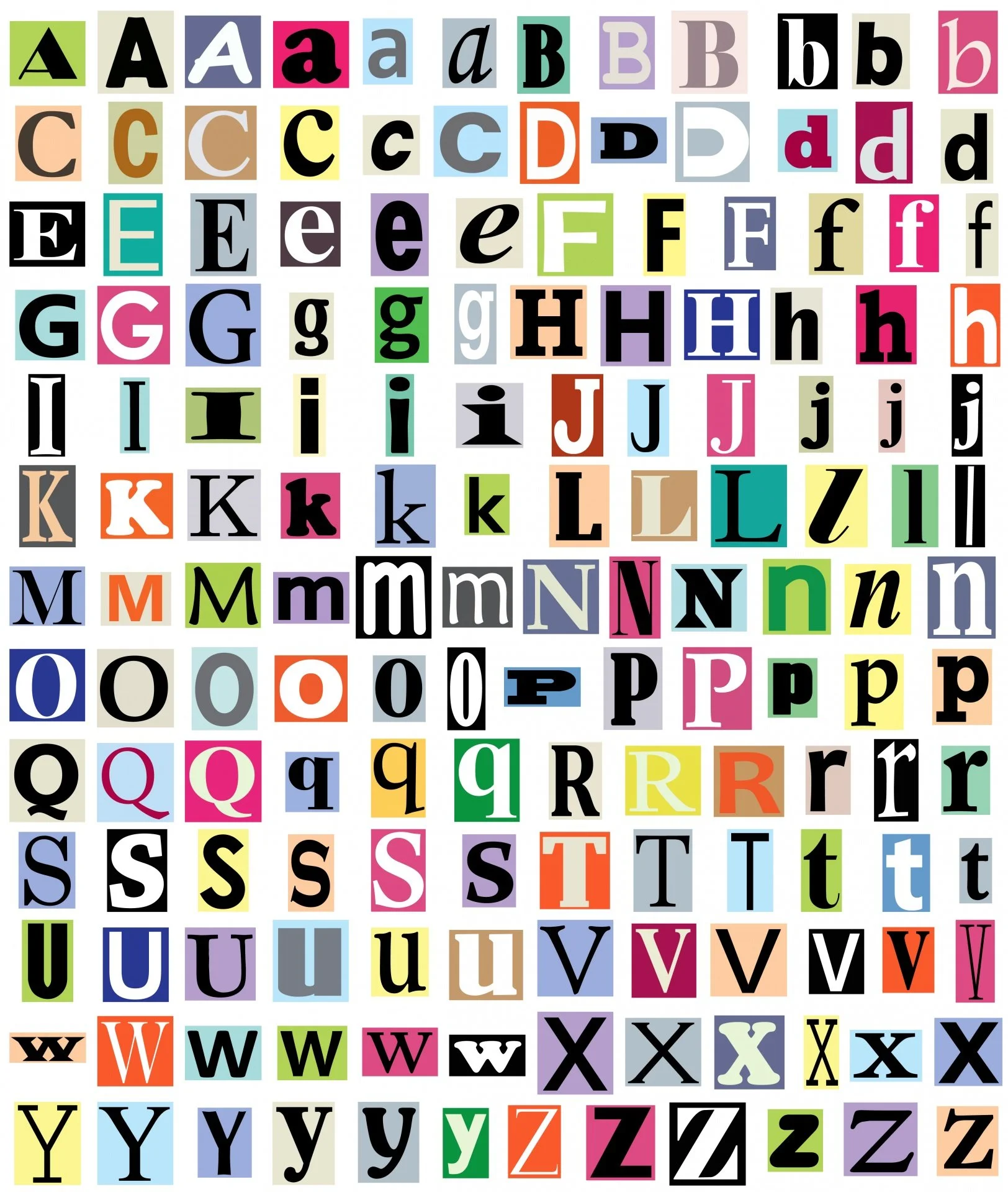
“Buiilt-in Fonts“ is an array of eight free (both commercial and personal use) fonts that I find aesthetically pleasing for cut-outs needs. Fonts are randomly assigned (it’s more fun!), selecting from: Wunderbar, Witless, Troika, Survivant, Simple Slum, Rocks, Not Quite Right, Paper Johny.
“User Fonts“ (you can upload up to 10) is an array of user-uploaded fonts that are used in a similar fashion to built-in fonts (randomly assigned). I recommend to test the tool with Cut Out The Jams by Victor Coreas (free for personal, student and non-profit use).
Both uploaded images and fonts are stored in-memory, on the user-device, so only reasonably sized files are accepted as otherwise the tool becomes unusable.
Adding text and typography into my work really helps to get to that “mixed meaning” feel, yet I know I’m not the person who would pre-cut and neatly store alphabetised letters in plastic boxes. During Werkstatt Creative Coding course, one assignment sparked an idea: what if I could generate custom typography that had the same handcrafted feel as physical cut-outs?
I envision Typocut as a tool for designers, collage artists, and anyone who wants to create unique typographic elements for their work in digital (by saving transparent PNG) or in analog (A4 alphabet stickers).
I’ll be delighted to learn about how you’ve used the tool on Instagram or via the contact form.
What began as a simple "ransom note generator" and exercises in cutting out shapes based on existing fonts, evolved into Typocut - a tool that explores how analog could inform digital and digital can inform analog through creating free-form typographic elements that can be built from any color or image source:


As I’ve never designed a font before, I took some time to explore how letters could be broken down into a grid and what are the differences between pixel and parametric fonts (inspiration - 1, 2, 3 ).
I ended up with each letter being composed of primitive shapes - rectangles, triangles, half-circles, and cut-outs - that can be flipped and rotated as needed:


Adding bult-in fonts and providing an option for the user to upload theirs has been made possible by re-use of logic I've introduced for images (hidden upload system button, storing files in memory), re-using conditional hide/show for the images sub-menus and introducing decision forks in both masking functions.
The drawback of this late addition is that I'm re-using letter grid size as a container (as then all the line, and sticker calculations will be preserved) and the font size would is decided dynamically to fit each letter inside that container.


Making a tool for myself
Typocut is built with p5.js and leverages GUI library lil-gui by George Michael Brower.
When translated into code, each letter is defined by a sequence of two-digit codes that tell the program which shape to draw in each cell of the grid, using a simple “broker“ function. Noise and randomization are applied to give each character that handmade, imperfect quality that's so appealing in physical collage.
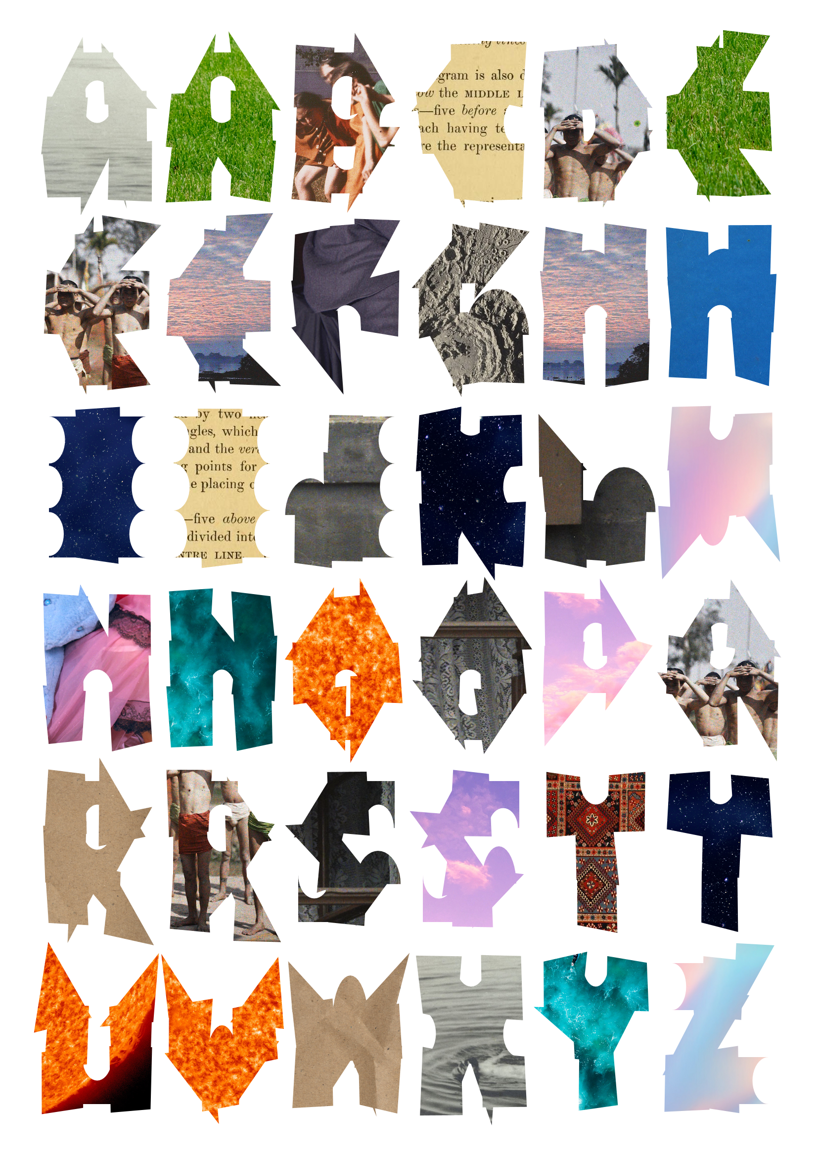
Each letter acts as a mask that reveals a section of an underlying image - either gradients or uploaded images. The mask can be inverted to create negative space letters that are cut out from solid shapes.
Check out README.MD on GitHub if you want to learn more and see the code.
Fun Stuff
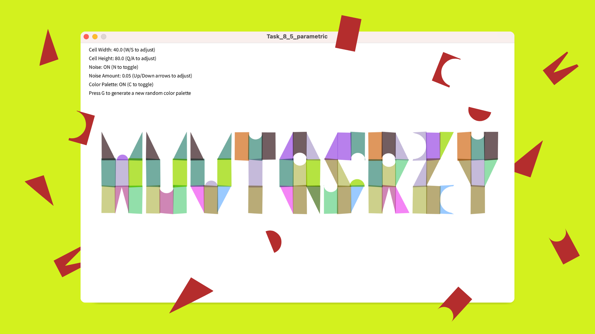
One of my favourite discoveries during this project was working with seeded randomness: every letter stores its own noise signature that's applied before drawing, ensuring that when you reposition letters or adjust parameters, each one keeps its distinctive character rather than randomising with every frame. This approach allows me to keep randomness while using “noise“ parameter, yet avoid letters wobbling. For the regular fonts I used a different distortion technique - shifting grid control points and re-mapping the pixels of the mask before applying it to the underlying image.


I wanted Typocut to bridge the digital and physical worlds. That's why I added the A4 sticker sheet feature, which generates a printable sheet of letters based on the standard frequency distribution of the English alphabet. This means more common letters like E, T, and A appear more frequently than Z, Q, and X - just like you'd find in a real typesetting kit.
The hidden file input for uploading your own images was another fun challenge. I wanted a seamless user experience without the clunky default file browser controls.
Latest Additions
While building first version of Typocut, my cut-outs were rather wonky, as I’ve used pixeldensity(1) - in the next version I’ve fixed that with pixeldensity(2) for the canvas and pixeldensity(4) for the saved images to achieve the desired edge crispness:
While I enjoyed the primitive, cut-out aesthetic of the original Typocut font, I wanted to expand creative possibilities without losing that distinctive collage feel. The solution was a three-tiered font system that lets you choose between my original cut-out designs, a collection of built-in fonts, and your own uploaded typefaces, while having the same features:


Building the font upload system was particularly satisfying. Similar to the image uploader, I created a hidden file input that accepts TTF and OTF files, processes them asynchronously, and makes them instantly available in the interface. The technical challenge was ensuring uploaded fonts rendered correctly at various sizes while maintaining the proper masking relationship with the source images.
What I find most interesting is how different typefaces interact with the noise and distortion effects (for the real fonts I employ grid displacement, example of somebody else’s sketch) - some fonts maintain their character even with heavy distortion, while others transform into completely new visual elements.
Technical Debt
I’m aware of some code duplication: as the project evolved from basic screen rendering to supporting exports and sticker sheets, I ended up with two masking functions (one for the main canvas, another one for previews). A more elegant solution would unify these with a target parameter after I crack the masking issues, yet I’ve chosen to invest my time into adding extra-features for “Upload your font” functionality.
It could be that new features made the tool slightly slower, yet I haven’t looked into that yet (my suspicion is that re-draw only should happen when something meaningful happens on the canvas). Let me know if are more versed in performance improvement than me and have better ideas!